As you might know by now I am re-implementing MyFitnessPal functionality into my own application to be deeper integrated with kitchen hardware and my own personal use-cases rather than to be an add infested subscription based 3rd party applilcation.
So the development of this is ongoing, but I wanted to note down some progress and explanation.
Let’s start with explaining the name: Tabemono.
It does really mean something – and as some might have guessed – in japanese:
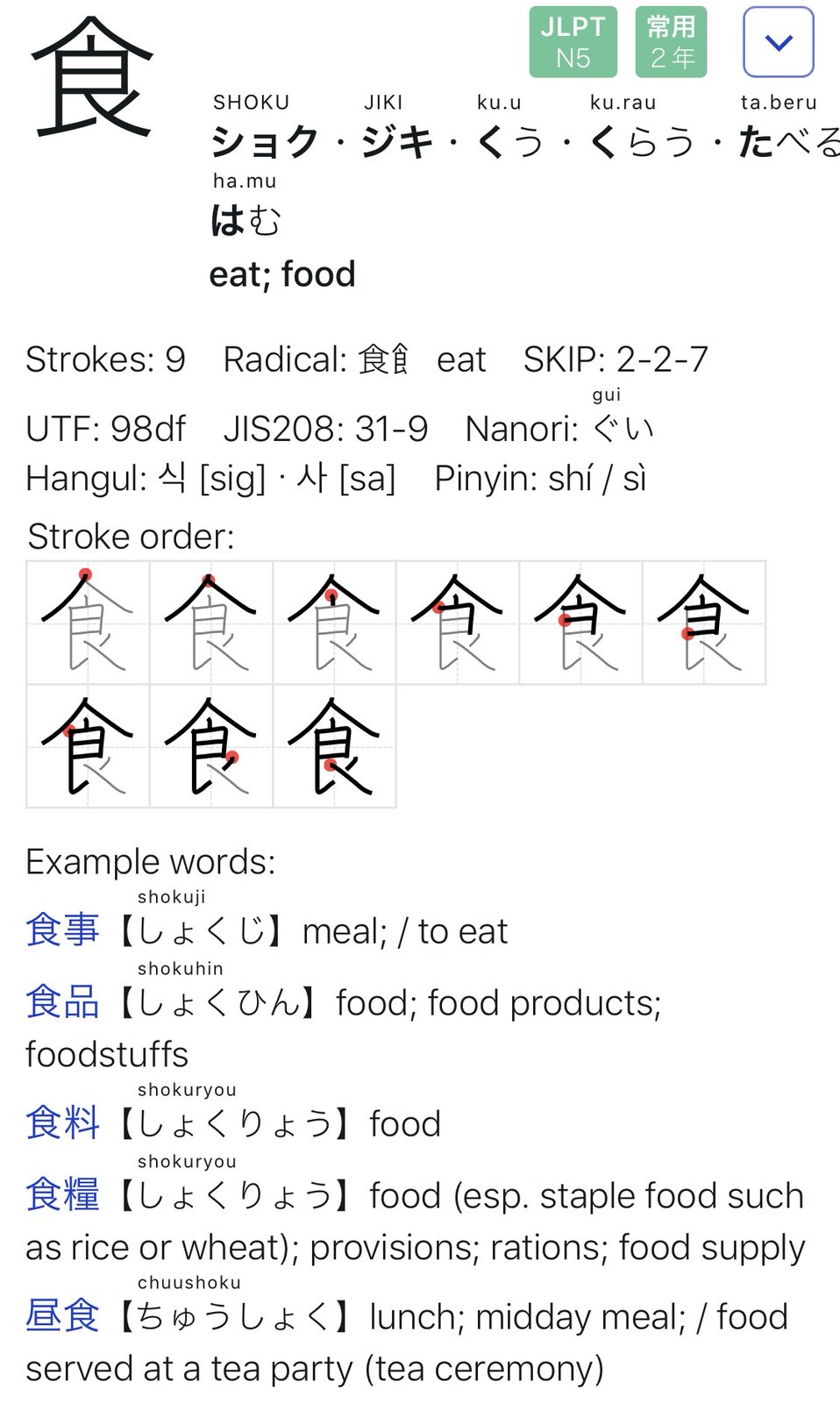
Tabemono – 食べ物
Taking just the first Kanji:

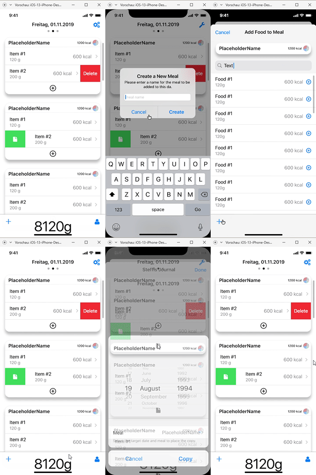
Implementing the UI from the UX has proven to be as challenging as expected.
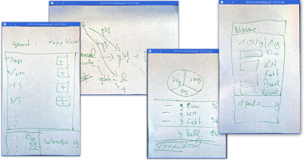
When we started to toss around the idea of re-implementing our food-tracking-needs we started with a simple scribble on post-it notes.
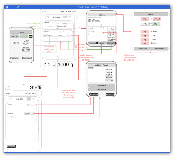
This quickly led to a digital version of this to better reflect what we wanted to happen during the different steps of use…
It wasn’t nice but it did act as an reminder of what we wanted to achieve.
The first thing we learned here was that this will all evolve while we are working on it.
So during a long international flight I’ve spent the better part of 11 hours on getting the above drawing into something resembling an iOS user interface mock-up. With the help of the (free for 1 private project) Adobe XD I clicked along and after 10 hours, this was the video I did of the click-dummy:

Since then I’ve spend maybe 1 more day and started the SwiftUI based implementation of the actual iOS application.
And this brought the first revelation: There are so many ideas that might make sense on paper and in a click-dummy. But only because those are just tools and not reality. It’s absolutely crucial to really DO the things rather than imagine them.
And so the second revelation came: If I had an advise to any product manager or developer out there: Go on and pick a project and try to go full-circle.
You ain’t full stack if you’re missing out on the understanding of the work and skill that your team members have and need.

